I enrolled in a Color Theory class years ago and it taught me so much, and one of the classroom assignments was to paint a canvas using only complementary colors. It was challenging but I was surprised how well that mini still life of yellow pears and lavender stems turned out! I find color theory fascinating, and love to study what works and what doesn’t, especially from the best designers and experts. With spring on its way, many crave more colorful accents indoors, here’s a color rule to help pull it off.
 Decorating with complementary colors is based on the simple principle that opposites attract and in turn enhance. Complementary colors are those that are directly across from each other on the color wheel, red and green, blue and orange, etc.
A few weeks ago I wrote about decorating with monochromatic color which is always a sure bet, however one way to energize a monochromatic space is to introduce a complementary color.
Blue and orange sit across from each other, and since aqua and coral continue to be popular hues in home decor, it works well to blend the two. A series of blue patterns are at play in this casual yet elegant living room; the touch of coral in the artwork and accent pillows spices it up.

A bold floral fabric, contrasting pillows, and abstract art in shades of vivid orange and aqua brighten this cozy living room.

Orange feels contemporary paired with classic navy blue, a healthy dose of white and natural light balance the bold combination.


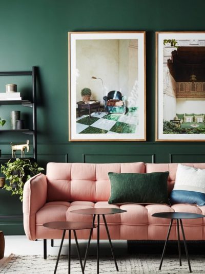
Red is the complement of green, but pink counts as it’s a paler version of red. I love a great deep pink and vivid green medley, raspberry is very fresh when paired with lime or apple green, deeper emerald and Kelly greens.


Purple and yellow are opposites on the color wheel, pastel hues like lavender and pale yellow feel perfectly at home in a girl’s room; aubergine and saffron are more mature and lend a global or Old World feel, especially with metallic sheens mixed in.


If you have a space dominated by one color, consider introducing its complement to invigorate, spaces are energized when complements collide! What about you? Have you had success mixing complementary colors in your home?
…

I love using the color wheel! I am so attracted to those bright colors right now. It feels like a breath of fresh air, and not the freezing cold kind so many of us are experiencing right now. My master is going to have touches of teal and bright pink. I can’t wait to start on it. Thanks for the inspiration. I really also love the purple and gold.
When choosing complementary colors, is it important to choose colors within the same hue? Or does that really matter? IE: Could I use raspberry pink with a very light green?? Or preferably a bolder green?
Great question Chrissy. If the complementary colors are pure or saturated then they can pair with each other regardless of tint so a bright raspberry would look wonderful with a pure light or a dark green. What’s interesting is when you mix the pigment of direct complements, they begin to muddy each other (or become more gray and muted) which leads to some really rich colors. There’s also the process of decorating with split complements, where you would mix one color with the colors analogous to its direct complement (the ones that sit next to it) and that’s a really fun medley too.
Decorating with rich plum and vibrant citron yellow is my absolutely favorite look. There is something so unexpected about the combination. I’m not quite sure I could convince my fiance to go for this look in our family room – but maybe touches of color in the master bedroom or guest bedroom. Ahh future house plans….
xo Rachel
Great article. But where does gray fall on the color wheel? What would be it’s complementary color?
Hi Mary. Gray is a neutral between black and white, with pigment it can lean in a certain color direction (blue, green, lavender) but it’s not considered a color for purposes of comparing complements. However, be happy that every color looks wonderful with gray!
Wonderful article and always like working with the colorwheel when I decorate but I’m a little stumped with something right now. I bought these beautiful curtains that I just love in a seaglass color but they turn colors from day to night, more greenish in the daytime and more blue in the evening. I’m wanting to find a color that will complement both colors for my wall but am stumped on which way to go. Grey seemed the natural choice, already have some bold blues in the room with furniture and a big brown leather couch that I call the big dark hole, I want something light and airy to complement the curtains…HELP? I’m stumped!
Hi Kelly, I’d add a neutral paint color in a similar blue with gray undertones, in an analogous color (gray green) or go for the complement across from a bluish green – a soft apricot (lighter version of coral). Try a bunch of samples so you can see how they work with your curtains with the changing light.
So, where’s your still life? You can’t mention it and then not show us! Please don’t leave us all hanging! :)
Where’s a picture of your still life? You can’t mention it and then not show us! Please don’t leave us hanging! :)
Color theory is fascinating. It is also confusing to me. I would rather take my color inspiration from a season, a painting, a fabric. Fall colors are my favorite but yet the color wheel does not group them together in any way. Is there a term for picking half of the color wheels colors? Great article, I hope you do more of them. I second the show us the painting comment. Have a great weekend! P.S. I voted for you, I hope you when you most certainly deserve it.
Wow, I have never thought of color in such a scientific way. Thanks for sharing! This information is enlightening.
This information is so interesting, and so useful to me as I work through redecorating my living room. The bright blue draperies are breathtaking. I didn’t realize what a dramatic impact your window treatments can have on the whole feel of a room until I renovated mine. I used a blinds company in royal oak and I couldn’t be happier
I’m a big fan of lots of colour but I’m terrible at putting them together, love this post, thanks!
I took a color theory class in college and the lesson that has stuck with me the most is how colors impact each other. We had an assignment to cut holes in pieces of colored paper (like paint swatches) and place those over other color swatches to see how they changed each other. I still do that little exercise (sort of!) when considering whether to use two colors together!
Awesome tip Libby, yes you’re so right!! They do affect each other when they’re next to each other